Pat made this adorable baby quilt and we had a slight issue on our hands...
You see that pink-ish batik surrounding each of the blocks? Well, it was the backing fabric too and it's one of those weird colors. It's orange-y next to pink and too pink next to orange. I laid out the quilt with a light pink thread, an apricot color and a light orange over a couple days through changes in the light and then made my decision of which thread would work the best. It actually was the light pink that won out (It's a Girl - So Fine).
Not to take away from any of the blocks and the fussy cut panels, we kept the quilting simple with an overall swirl.
I wish you could have seen this quilt in person, the colors were beyond perfect! I grew up collecting Beatrix Potter and I never would have picked these colors, I always would have picked more dusty hues, but this quilt was refreshing!
Thank you, Pat! Your quilt was so much fun to work on (as always!).
Showing posts with label Batiks. Show all posts
12.29.2016
12.16.2016
Machine Quilting: Opportunity Quilt
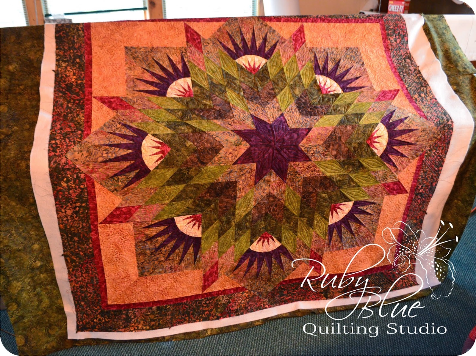
Sue and the other ladies in the Flying Geese Quilt Guild in Irvine, CA sent me this quilt to work my magic on...
This quilt is large and absolutely covered in amazing applique! Seriously, the only "real piecing" in the entire quilt are the HSTs in the sashing. That's it. Everything else you see is applique. You also have an opportunity to win this quilt - keep on reading and prepare yourself for photo overload! I love this quilt and took a TON of pictures. I couldn't help myself!
The challenge with a quilt like this is to make the quilting be functional and emphasize the details without competing for attention. This border was one of those moments where less-is-more. Simple straight lines to fill the background accent the curvy swirly applique and make it pop.
Each block had it's own feel and design. Some blocks are blatantly seasonal where some are a little more subtle like this one.
We only chose a few background designs and I think two different fillers for the vases. Again, less is more when there's so much to look at with this quilt to begin with.
I love some applique pieces that show up to me looking like blobs. These flowers for instance, I knew they were supposed to be flowers, but without being familiar with the pattern I wasn't sure what type of flower.
Remember when you take a quilt to a quilter - you've been staring at that pattern for a long while, they may have never heard of it. Don't assume your quilter is familiar with every pattern you're working on.
I wasn't sure if they were something specific that I needed to be aware of or if they were just a blob that needed to look like a flower. They were just non-typical blobs in this case and I'll show you below what I did in the details.
When in doubt with flowers, most radiate out from a central point so I started there and used wavy lines to fill the flower until I got to the edge. Each one is a little different!
The center block was this amazing house and I used the details in the fabrics to guide me and filled in the other details as I could. All those art perspective lessons are still coming in handy!
I don't know why, but I loved these eggs. And seriously, all of this applique was AMAZING! It all makes what little I've dabbled in applique look wonky and rough. These ladies use the most teeny tiny stitches that are absolutely perfect!
Oh, here's more details on the house!
I really enjoyed working on this quilt block by block and watching it come to life. It was one of those projects where at the end of each day I got to stand back and be like - did I do that??? This is really my job??? Say it isn't so!
The HSTs in the sashing perplexed me when we were planning the quilting because of all the contrast in the fabrics. I was originally thinking of coming up with two different designs, one for the light and another for the dark. But you know what, the more I stared and pondered at this quilt, simple was best again and this orange peel was the winner! It filled the area well but also was the perfect divider for each block and border. It's amazing how it looks on the back too (you'll see that in a bit).
The colors, the textures. This is one of those times that a quilt being full of amazing batiks with a few prints dabbled in here and there was the perfect mix. This quilt could not have been this vibrant without all those batiks!
Here's some more shots of the quilt as best I could get laying this monster on the floor of the studio.
And here's the back. I love a good pieced back and I love how you can see each and every block and detail from the front of the quilt.
Here's the house! Isn't it too stinkin' adorable?!
Again, you can see the orange peel in the sashing separating all of the blocks and the border. Seriously click on each of these pictures of the back and zoom in to see all the details. It's amazing what you can see!
Oh, and before you ask, this entire quilt was done with only two threads, both tans. One just a tad darker than the other.
And now for the even more fun part. Remember how I said you could win this quilt? Well, this is the Flying Geese Quilt Guild's Opportunity quilt for 2017. Kinda like a raffle quilt with a different title. If you're going to be in the Irvine, CA area the beginning of June 2017, you could see this quilt in person. The quilt winner will be drawn at the quilt show on June 4th.
Not going to be in Irvine? Not even in California? Maybe you're stuck in Ohio like me? No worries, you can purchase tickets! Just contact Sue at sue.glass (at) verizon (dot) net for ticket information. Trust me, this quilt is amazing and whoever gets to win this quilt will forever be stalked by me. Okay, maybe that's a bit harsh, maybe I'll just get my tickets and cross my fingers that this quilt gets to come back to Ohio and live with me forever. Just drop Sue a line and she will get you all the info you need to get your own tickets!
I couldn't wait to share this quilt with all of you, but I had to be patient and persistent and catch up in my quilty photos. Don't worry, I still have plenty more quilts to share, but for now, get your tickets from Sue and drool over these photos until you get the call in June that you won the quilt. I will remind you all before the big day seeing as how it's almost Christmas and all. There's still plenty of time! Email Sue and tell her I sent you!
6.17.2015
Machine Quilting: Crazy Thistle Pods
I don't mean crazy as in this quilt is crazy. I mean the quilting in this quilt is crazy! Maryellen sent me this quilt after she worked on it for a long time. Knowing that she put blood, sweat, and tears into this quilt, she wanted the quilting to be in the same ballpark.
I mean seriously, when you have this much work in all of those points and curves... you want the quilting to be awesome. And crazy. And that's what we did.
Maryellen and I went back and forth for a while trying to decide on a plan. There were definite elements she knew she wanted in the quilting and other areas we had to figure out as we went. All in all, it is stunning, but I'll let the pictures do the talking...
I only used two different threads for the top - a light green and a variegated blue and green for the darker fabrics. The majority of the quilt was filled with a mixture of pebbles, swirls and a random feather or two.
The outer border was split between these fun feathers in the lighter fabrics and simple shadow compasses (mimicking the pieced compasses) and wavy lines in the darker fabrics.
The variegated thread worked so well in the darker fabrics. It had just enough pop and sparkle without being too bold.
These stars are very similar to a New York Beauty block that you'll find in several of Judy Niemeyer's patterns (this is four of them put together). I quilted this ribbon candy design in a New York Beauty section of this quilt, and I knew it would look so neat as a continuous design in a circle. To contrast the curves in the center and the pebbles in the background, the spikes were kept simple with straight lines.
The biggest trick with quilts like this that have several complex elements already - keep it all cohesive. You don't want any one area to stand out too much and it all has to work well together.
I can't get enough of these feathers! I may have to do them again soon! You can probably see a shadow compass here a bit better.
All in all, this quilt is large and crazy quilted. However, at the end of the day I'm so excited with the result and Maryellen is too. I think her exact word when she got the quilt back was YOWZA!
I could stare at this quilt all day...
I love how the texture turned out and everything is quilted just enough...
I used two different threads on the back of the quilt, but both blend in well enough on this fun fabric.
I love being able to see the designs and details on the back as well as the front.
Here you can see the thread detail a bit better. The fabric was a very blue-green and it altered the thread colors just enough that my first choices were too bright or dark or something. I ended up using Midnight Harbor and Olive Green and I'm so pleased with how they worked out. In this picture, the blue is on the left and the green is on the right. The straight lines are done, one of each color.
I chose to use the blue with the variegated thread since I was dealing with batiks top and bottom. It limits the range of thread colors I can use (if I'm not using the same thread top and bottom) since batiks are woven much denser and can cause some tension issues if you're not careful. The closer the thread colors are to eachother, the better the end results will be.
Phew, what a quilt! Wouldn't you agree? Thank you, Maryellen!!! I hope some binding fairies came to help and you can enjoy your masterpiece of a quilt.
If you're interested in learning more about my quilting services, please e-mail me at RubyBlueQuilts at gmail dot com, or you can see more information on the Machine Quilting Information page here on the blog.
4.20.2015
Seems Like Scrappy Preview: Shimmer
If there is one style that I gravitate towards when I'm designing quilts, it's probably star quilts. There are so many little adjustments you can make to change the personality of the block. With that kind of versatility, I find star quilts work great for anyone and any style. They're not gender, age or style specific so star quilts cater to a much broader audience. The quilt I'm about to show you fits into this category wonderfully!
Meet Shimmer! I love this quilt. It's a star quilt, there's no doubt about that, but it's interesting... I love the fact that every person I have shown this quilt to sees something different. Some people notice a lattice type effect, some pick out the secondary stars in the design, and some just gawk with their jaw on the floor (and that's perfectly fine with me, just don't drool on the quilt).
Shimmer is created with the Tonga Treats 6-Pack. The 6-Pack is a fairly new bundle that includes 20 strips that are each 6" wide x WOF. Some packs have 20 different fabrics and some have less fabrics (some duplicates may be in the pack), but this new bundle is a great way to still have a coordinated fabric group and still have a nice bit of fabric to play with.
Sometimes when I'm playing with a new design and I find a new fabric I like, I'll grab a charm pack... Then once I get into the project I fall in love even more with the fabric and wish I had more of it to play with... Sometimes I'd like a little more heft to satisfy my fabric craving. You can get that with the Tonga Treats 6-packs. Unlike a fat quarter bundle, the strips are still the width of fabric so it feels like yardage and it tricks your brain into thinking there is more fabric in there.
One of my favorite aspects of making scrappy quilts is when I can take a simple design and add extra pieces into it. It's part of my "the more the merrier" mentality. For instance, some of the triangles are whole, and some are pieced in this quilt. Part of the reasoning for that was to make it easier to sew the blocks together, and part of the reason was simply because I could. :)
The bundle I created this quilt with obviously had a simple fall-like color palette to it and I love how it turned out. However, don't forget that this whole new book is full of tips and tricks if you'd like to use your stash too! This would be amazing with a smattering of whatever fills your scrap bins thrown together. With a more eclectic color palette, parts of this design may stand out mare giving your quilt a totally new look from the original!
Shimmer and all of the other quilts I've shared each Monday are patterns in my new book, Seems Like Scrappy, due out this June. Come back each Monday to see a new quilt from the book and I'll keep you posted on when you too can get a copy! I know June is still a bit away, but I have that feeling that if I blink, it'll be here in an instant! I can't wait to share the book with all of you!
Photo used with permission from Martingale. Photography by Brent Kane. All rights reserved.
Shimmer is created with the Tonga Treats 6-Pack. The 6-Pack is a fairly new bundle that includes 20 strips that are each 6" wide x WOF. Some packs have 20 different fabrics and some have less fabrics (some duplicates may be in the pack), but this new bundle is a great way to still have a coordinated fabric group and still have a nice bit of fabric to play with.
Sometimes when I'm playing with a new design and I find a new fabric I like, I'll grab a charm pack... Then once I get into the project I fall in love even more with the fabric and wish I had more of it to play with... Sometimes I'd like a little more heft to satisfy my fabric craving. You can get that with the Tonga Treats 6-packs. Unlike a fat quarter bundle, the strips are still the width of fabric so it feels like yardage and it tricks your brain into thinking there is more fabric in there.
One of my favorite aspects of making scrappy quilts is when I can take a simple design and add extra pieces into it. It's part of my "the more the merrier" mentality. For instance, some of the triangles are whole, and some are pieced in this quilt. Part of the reasoning for that was to make it easier to sew the blocks together, and part of the reason was simply because I could. :)
The bundle I created this quilt with obviously had a simple fall-like color palette to it and I love how it turned out. However, don't forget that this whole new book is full of tips and tricks if you'd like to use your stash too! This would be amazing with a smattering of whatever fills your scrap bins thrown together. With a more eclectic color palette, parts of this design may stand out mare giving your quilt a totally new look from the original!
Shimmer and all of the other quilts I've shared each Monday are patterns in my new book, Seems Like Scrappy, due out this June. Come back each Monday to see a new quilt from the book and I'll keep you posted on when you too can get a copy! I know June is still a bit away, but I have that feeling that if I blink, it'll be here in an instant! I can't wait to share the book with all of you!
4.07.2015
Seems Like Scrappy Preview: Nova
It's still Monday, right? Well, over here I'm considering this Monday Part Two.
So sorry I didn't post yesterday. Let's just say that the holidays and my family don't mix. Someone inevitably ends up at an urgent care or an ER... Everyone is fine, life is good, there was just a little hiccup so I couldn't post yesterday. How about we get to that quilt, shall we?
I'd like you to meet Nova! Nova, meet everyone!
Some of you may know, others may not. I have a serious art background. I have been drawing practically since I could hold a crayon. This led me to a college program for Graphic Design which then led to my love of quilts along a scenic journey.
I love quilts for their use of color and texture and math! It's true, there is a LOT of math that goes into designing a quilt. This quilt is an even blend for me of the art and the math in quilts. I always thought it would be fun to create a pixellated quilt, but I just couldn't quite get the look I was going for. Most of my quilting doodles would start out with something like this and then I was onto the next doodle.
I honestly don't even remember how this design ended up going from a doodle to a quilt. There must have been a lack of coffee that morning. I just remember the instant I knew it would work. That was a great feeling.
Nova is created using charm packs and yardage for the background, however for an even scrappier look you could substitute mini charms. I had this explosive type coloring in mind (explosive like explosive drawings, not the big boom kind of explosion) and I had fun playing with the colors and textures to create this effect.
This was one of the first quilt tops I completed for this book, but one of the last to get quilted. I had this image in my head of how I wanted the quilting to look and I just couldn't figure out how to do it free motion. Then one day I started stumbling around online and found Abby through Pinterest or Instagram and she just happened to post a new design for her computerized machine and it was EXACTLY what I had in mind!!! This design is called rain puddle I think... Either way, it's perfect and I couldn't be happier with how it turned out. For more information on Abby's quilting services, you can visit her here.
All in all, Nova turned into one of the most fun and free thinking quilts that truly speaks to the inner artist in me. It could also speak to the inner whatever in you! I would like to make this quilt again, but I can't decide what fabrics I'd like to use. At one moment I'll think it would look great in soft yet bright florals and a white background... Then I start thinking it would be fun in a monochromatic scheme for a more subtle approach... And then I look in my stash and come up with too many options to pick just one.
If I can ever make a decision and actually start to cut fabric, I will be sure to post pictures here! This is a very fun, very fast, very forgiving quilt that everyone is sure to love! What colors and fabrics would you choose to make your version out of? You just may sway my decision (whenever I get around to making it)
Have a great day and come back next Monday for more quilts from my new book, Seems Like Scrappy, due to be released this June! For other quilts that have already been featured from this new book, click here.
So sorry I didn't post yesterday. Let's just say that the holidays and my family don't mix. Someone inevitably ends up at an urgent care or an ER... Everyone is fine, life is good, there was just a little hiccup so I couldn't post yesterday. How about we get to that quilt, shall we?
Photo used with permission from Martingale. Photography by Brent Kane. All rights reserved.
Some of you may know, others may not. I have a serious art background. I have been drawing practically since I could hold a crayon. This led me to a college program for Graphic Design which then led to my love of quilts along a scenic journey.
I love quilts for their use of color and texture and math! It's true, there is a LOT of math that goes into designing a quilt. This quilt is an even blend for me of the art and the math in quilts. I always thought it would be fun to create a pixellated quilt, but I just couldn't quite get the look I was going for. Most of my quilting doodles would start out with something like this and then I was onto the next doodle.
I honestly don't even remember how this design ended up going from a doodle to a quilt. There must have been a lack of coffee that morning. I just remember the instant I knew it would work. That was a great feeling.
Nova is created using charm packs and yardage for the background, however for an even scrappier look you could substitute mini charms. I had this explosive type coloring in mind (explosive like explosive drawings, not the big boom kind of explosion) and I had fun playing with the colors and textures to create this effect.
This was one of the first quilt tops I completed for this book, but one of the last to get quilted. I had this image in my head of how I wanted the quilting to look and I just couldn't figure out how to do it free motion. Then one day I started stumbling around online and found Abby through Pinterest or Instagram and she just happened to post a new design for her computerized machine and it was EXACTLY what I had in mind!!! This design is called rain puddle I think... Either way, it's perfect and I couldn't be happier with how it turned out. For more information on Abby's quilting services, you can visit her here.
All in all, Nova turned into one of the most fun and free thinking quilts that truly speaks to the inner artist in me. It could also speak to the inner whatever in you! I would like to make this quilt again, but I can't decide what fabrics I'd like to use. At one moment I'll think it would look great in soft yet bright florals and a white background... Then I start thinking it would be fun in a monochromatic scheme for a more subtle approach... And then I look in my stash and come up with too many options to pick just one.
If I can ever make a decision and actually start to cut fabric, I will be sure to post pictures here! This is a very fun, very fast, very forgiving quilt that everyone is sure to love! What colors and fabrics would you choose to make your version out of? You just may sway my decision (whenever I get around to making it)
Have a great day and come back next Monday for more quilts from my new book, Seems Like Scrappy, due to be released this June! For other quilts that have already been featured from this new book, click here.
3.09.2015
Seems Like Scrappy Preview: Patch Stack
I know I should've written this post over the weekend and scheduled it... I should've and I didn't. And now it's late-ish morning because Daylight Savings Time didn't hit me until this morning when it was still pitch black at 7am and the dogs and I didn't want to get up... Oh well, better late than never!
Today I want to introduce you to Patch Stack:
There are 14 quilts in Seems Like Scrappy and they are made with an array of your favorite precuts like charm packs, layer cakes, jelly rolls and fat quarters. However there are two new precuts featured in this new book including honeycombs (6" hexagons) and Tonga 6-packs. This pattern features the Tonga 6-pack.
What is a Tonga 6-pack? Timeless Treasures has released this relatively new precut that contains 20 strips that are each 6" wide x WOF. Some of the packs contain as few as 10 fabrics (two cuts of each fabric) and some packs contain 20 different fabrics. I like this particular precut because you can get a decent amount of fabric and still have a nice variety of colors. I love my jelly rolls, but sometimes that 2 1/2" wide strip just isn't enough fabric that it satisfies my fabric craving...
In Patch Stack, I used the Tonga 6-pack for the creamy and greenish tones. I used yardage for the blue background and I love how this quilt looks masculine yet interesting. I love the colors because I live so close to Lake Erie, it gives off that lake vibe. However, I think this quilt would look amazing in a totally scrappy mix of prints reminiscent of a grown up I Spy.
This quilt was so easy to make and even easier to layout and piece. I thought it would be much harder than it was so I made the pieces and laid it out, then I gathered them up and set it aside for a long time. I don't know what I was afraid of! I started stitching the rows together and was only planning to fill a small amount of sewing time I had open. It was a boring night with nothing much going on and I just wanted to sew for a bit. Not long into my hour or so I set aside to sew, I was almost done with the top, so I kept going!
Patch Stack finishes at a decent size (71" x 86") so it would be a great large throw or a twin size. That's also without borders, so the size can easily grow if you'd prefer it a bit larger if you added borders.
I love this quilt and I hope you do too! Remember that I will be back here each Monday showing off a new quilt from Seems Like Scrappy before it's release in May.
Also, if you missed it over the weekend, I put together a little chart listing the three most popular precut sizes and the names each fabric company uses to identify them. It's a free pdf printable and you can get to it by clicking here.
And last but definitely not least, tomorrow there will be a super exciting post you'll definitely want to checkout... did someone say giveaway??? Come back tomorrow for the details. Have a great day! I'm going to enjoy my coffee and get in gear... I've got quilts to make!
Today I want to introduce you to Patch Stack:
Photo provided by Martingale, Photography by Brent Kane
What is a Tonga 6-pack? Timeless Treasures has released this relatively new precut that contains 20 strips that are each 6" wide x WOF. Some of the packs contain as few as 10 fabrics (two cuts of each fabric) and some packs contain 20 different fabrics. I like this particular precut because you can get a decent amount of fabric and still have a nice variety of colors. I love my jelly rolls, but sometimes that 2 1/2" wide strip just isn't enough fabric that it satisfies my fabric craving...
In Patch Stack, I used the Tonga 6-pack for the creamy and greenish tones. I used yardage for the blue background and I love how this quilt looks masculine yet interesting. I love the colors because I live so close to Lake Erie, it gives off that lake vibe. However, I think this quilt would look amazing in a totally scrappy mix of prints reminiscent of a grown up I Spy.
This quilt was so easy to make and even easier to layout and piece. I thought it would be much harder than it was so I made the pieces and laid it out, then I gathered them up and set it aside for a long time. I don't know what I was afraid of! I started stitching the rows together and was only planning to fill a small amount of sewing time I had open. It was a boring night with nothing much going on and I just wanted to sew for a bit. Not long into my hour or so I set aside to sew, I was almost done with the top, so I kept going!
Patch Stack finishes at a decent size (71" x 86") so it would be a great large throw or a twin size. That's also without borders, so the size can easily grow if you'd prefer it a bit larger if you added borders.
I love this quilt and I hope you do too! Remember that I will be back here each Monday showing off a new quilt from Seems Like Scrappy before it's release in May.
Also, if you missed it over the weekend, I put together a little chart listing the three most popular precut sizes and the names each fabric company uses to identify them. It's a free pdf printable and you can get to it by clicking here.
And last but definitely not least, tomorrow there will be a super exciting post you'll definitely want to checkout... did someone say giveaway??? Come back tomorrow for the details. Have a great day! I'm going to enjoy my coffee and get in gear... I've got quilts to make!
3.02.2015
Seams Like Scrappy Preview: Dot Plus Dash
There are several quilts from this new book (due out in May) that I have either made again, have started a second version, or plan to make another. Not this one:
Meet Dot Plus Dash. I was inspired by all of the "modern" quilts featuring plus designs and one morning I got to sketching and then before you know it, corners got added to the block and once a sashing was added it made a secondary design and here it is.
This pattern was designed to use Layer Cake squares (10" squares) but for this quilt I used a Bali Tile pack. I thought I had Bali Crackers, which would be 10" squares, but I grabbed the Tile pack instead which has 10 wide strips with large designs that can be cut to make 40 squares. Essentially I ended up with the same "look" I was going for, but with less fabric variety and a little more cutting on my part. No biggie.
Dot Plus Dash is a great sized quilt as either a large lap or a small twin size. If you're looking for a great quilt with a big visual impact, but you just want results... If you're heading to a retreat and you don't want to have to rip out all of your stitching if you got side-tracked while chatting... If you just finished a project that made you want to pull your hair out and you couldn't speak in full sentences when it was finished... This is the quilt for you.
It is just one block with simple piecing and it goes together so fast. It's just simple almost mindless piecing. This is the type of piecing that's rhythmic and almost like meditating. Alright... I know I started this post saying I wasn't planning on making this one again, and really I wasn't. I love the rich vibrant understated colors and the quilting (I'll get to that in a minute) and I didn't think I could make a version that I'd love as much. But talking about how much fun this was to make, I may just have to have one of these cut up and set aside for a movie marathon kind of day or an at home sewing retreat. A girl can't have too many quilts, right?
Now onto the quilting! If you look really closely at the picture above, you can see Abby quilted in wavy lines and it just emphasizes the simpleness and modernistic vibe of this quilt and I love it!
Wait, what?! I didn't quilt this?! And the answer to that would be no. I already had a bunch on my plate trying to make all of the quilts and do the writing and illustrations and I had my own customer quilts piling up, so I sent out a few quilts to be done by a digitized design. This quilt and one other have designs that were quilted by Abby Latimer of Latimer Lane Quilting. She did an amazing job and if you see a digitized design you'd like to have done on your quilt, send it on over her way and you won't be disappointed!
Honestly, I love doing free motion or hand guided quilting, but there are just some designs that work better on a computer. For this quilt, the wavy lines would be nearly impossible to keep as smooth and clean even with a laser guide or rulers. Ugh, I can't even imagine doing this whole quilt with rulers like that, I'd lose my mind after the first hour which wouldn't get me very far. I absolutely love how it turned out and I'm building up a mental list of the quilts I'd like to send to Abby in the future.
Yes, I could quilt my quilts and whatever, but I also like to "share the wealth" and celebrate the work that other quilters can do. There are so many wonderful quilters out there that do an amazing job and whether they use a computer or not, we all have our own style and interpretation of quilts and that makes us unique. I still like how other people do feathers or swirls and mine will never look like theirs. But then again, theirs will never look like mine and that's fine with me. It's like shopping at different quilt shops. If you only shop at one shop, you'll never get to experience the style and different fabrics at other shops. There's so much out there to see, not one shop can have it all. Now, there's many that try, but we all have something to share, so be open minded.
Time to reel myself in, sorry I'm writing while I'm drinking my coffee and it's still early. Whose idea was it to put these posts on a Monday? Oh wait, that was me :)
So anywho, Dot Plus Dash is featured in Seems Like Scrappy that is due out this May (no changes at the moment have been announced for the release date officially, but with the port strikes coming to a swift end, I'm crossing my fingers the release will not be delayed).
I will be showing this quilt and all of the others at Spring Market (it'll be here before we know it) so if you're planning on attending, come see me! I will be doing a Schoolhouse and book signings, but I will post the detailed information closer to the actual event. I'd love to see you and show off my quilts! But what if you're not coming to Market? What if you still want to see all of the quilts? I'm open to travel and trunk shows as well!
Contact me at rubybluequilts (at) gmail (dot) com if you would like to host a book signing or would like me to come do a trunk show for your guild or group. Workshops can also be arranged, e-mail me to discuss the possibilities!
I'm so excited about this book and I hope you are too. Now I have to go raid my stash and cut out another quilt because I can... It's a sickness I swear! Have a great day!
Photo provided by Martingale, photography by Brent Kane
This pattern was designed to use Layer Cake squares (10" squares) but for this quilt I used a Bali Tile pack. I thought I had Bali Crackers, which would be 10" squares, but I grabbed the Tile pack instead which has 10 wide strips with large designs that can be cut to make 40 squares. Essentially I ended up with the same "look" I was going for, but with less fabric variety and a little more cutting on my part. No biggie.
Dot Plus Dash is a great sized quilt as either a large lap or a small twin size. If you're looking for a great quilt with a big visual impact, but you just want results... If you're heading to a retreat and you don't want to have to rip out all of your stitching if you got side-tracked while chatting... If you just finished a project that made you want to pull your hair out and you couldn't speak in full sentences when it was finished... This is the quilt for you.
It is just one block with simple piecing and it goes together so fast. It's just simple almost mindless piecing. This is the type of piecing that's rhythmic and almost like meditating. Alright... I know I started this post saying I wasn't planning on making this one again, and really I wasn't. I love the rich vibrant understated colors and the quilting (I'll get to that in a minute) and I didn't think I could make a version that I'd love as much. But talking about how much fun this was to make, I may just have to have one of these cut up and set aside for a movie marathon kind of day or an at home sewing retreat. A girl can't have too many quilts, right?
Now onto the quilting! If you look really closely at the picture above, you can see Abby quilted in wavy lines and it just emphasizes the simpleness and modernistic vibe of this quilt and I love it!
Wait, what?! I didn't quilt this?! And the answer to that would be no. I already had a bunch on my plate trying to make all of the quilts and do the writing and illustrations and I had my own customer quilts piling up, so I sent out a few quilts to be done by a digitized design. This quilt and one other have designs that were quilted by Abby Latimer of Latimer Lane Quilting. She did an amazing job and if you see a digitized design you'd like to have done on your quilt, send it on over her way and you won't be disappointed!
Honestly, I love doing free motion or hand guided quilting, but there are just some designs that work better on a computer. For this quilt, the wavy lines would be nearly impossible to keep as smooth and clean even with a laser guide or rulers. Ugh, I can't even imagine doing this whole quilt with rulers like that, I'd lose my mind after the first hour which wouldn't get me very far. I absolutely love how it turned out and I'm building up a mental list of the quilts I'd like to send to Abby in the future.
Yes, I could quilt my quilts and whatever, but I also like to "share the wealth" and celebrate the work that other quilters can do. There are so many wonderful quilters out there that do an amazing job and whether they use a computer or not, we all have our own style and interpretation of quilts and that makes us unique. I still like how other people do feathers or swirls and mine will never look like theirs. But then again, theirs will never look like mine and that's fine with me. It's like shopping at different quilt shops. If you only shop at one shop, you'll never get to experience the style and different fabrics at other shops. There's so much out there to see, not one shop can have it all. Now, there's many that try, but we all have something to share, so be open minded.
Time to reel myself in, sorry I'm writing while I'm drinking my coffee and it's still early. Whose idea was it to put these posts on a Monday? Oh wait, that was me :)
So anywho, Dot Plus Dash is featured in Seems Like Scrappy that is due out this May (no changes at the moment have been announced for the release date officially, but with the port strikes coming to a swift end, I'm crossing my fingers the release will not be delayed).
I will be showing this quilt and all of the others at Spring Market (it'll be here before we know it) so if you're planning on attending, come see me! I will be doing a Schoolhouse and book signings, but I will post the detailed information closer to the actual event. I'd love to see you and show off my quilts! But what if you're not coming to Market? What if you still want to see all of the quilts? I'm open to travel and trunk shows as well!
Contact me at rubybluequilts (at) gmail (dot) com if you would like to host a book signing or would like me to come do a trunk show for your guild or group. Workshops can also be arranged, e-mail me to discuss the possibilities!
I'm so excited about this book and I hope you are too. Now I have to go raid my stash and cut out another quilt because I can... It's a sickness I swear! Have a great day!
1.15.2015
Machine Quilting: Summer Solstice Deja Vu
I got an email from Lindsay one day and she was super excited to finish up her Summer Solstice quilt but was in that mood of "now what?". She sent it off to me and said she liked the original version of this quilt that I had done, but if the mood struck me to try something new or add something in, go for it. (I love when that happens) and this is what we ended up with:
This quilt was made just like the original Summer Solstice I quilted because that quilt was featured in Timeless Treasure's booth at Market and turned into a project sheet for other shops to make into kits. It was interesting for me working with the two quilts because of the slight change in the coloring of the fabrics (the original quilt was made with advance yardage and this quilt was made with the actual fabrics from their normal release date, plus batiks can differ from run to run so that could've been it too). The tans were a bit deeper, the greens were more vibrant, the orange was a bit bolder, but it still has that same charm as the original quilt.
The first major change I did with this quilt was play up the piecing in the border fabric. This fabric was much brighter and had more vibrancy than the original quilt, so I used that to my advantage. I kept some of the quilting in the tan areas the same...
Here you can see the quilting better in the borders. I also made a slight change to the quilting in the orange, but not a major one...
I did however change up the center a bit and tried a new design in the inner background of the New York Beauty blocks and I will be using that again in the future!
With this design (and almost every quilt design that springs from my fingertips) I tried to keep it simple and relative by using about three or four designs scattered throughout the quilt so there is a consistency but you can still see each piece individually. This quilt was mainly line designs in a myriad of configurations, ribbon candy and tendrils with some swirls to calm the backgrounds.
The other little bit that I did differently with this quilt was to use this amazing raspberry colored thread in the magenta and purple areas including the center star (pictured above). It's a much bolder choice so I had to check with Lindsay before going forward with it because some people like their quilting a little more subtle. Luckily she loved it and I got to finish up this quilt and send it on it's way and I think it turned out awesome!!!
This pattern, unlike many of the other patterns designed by Judy Niemeyer, is relatively simple and methodical. Now, many of her other designs are methodical, but not simple... Not in the foggiest... For a quilter, this quilt is basically just diamonds, New York Beauty blocks and borders. Usually Judy's designs have like 27 different elements and there's a lot more planning that can go into them. The neat thing with this pattern is depending on how it's colored and where the accents lie, I can quilt each and everyone differently to make the personality of the quilt stand out. That's how I play and get creative and end of loving my job at the end of the day.
Lindsay did an amazing job piecing this quilt. This design is almost never square and here's why... The border is pieced with several angled pieces... and the corners are mitered too. Plus when you combine that with how this quilt top is constructed (it's weird, just trust me) no matter how good of a quilter you are, there is a ton of bias edges going on and it can get wonky fast.
Any quilt with a pieced border and mitered corners can have it happen. Basically you can think of the pieced border and the mitered corners as the exaggeration of the center of the quilt. If there is any bonus fabric in the center, it will find it's way to the outside and definitely into the corners... NOT LINDSAY'S!!!
It was awesome and I had such a fun time quilting it. I want to thank Lindsay for sending me her quilt to play on and letting me share the pictures with you too! Continuing on with the trend of quilts on the blog this week, I DID NOT want to send this one back. I may just have to break down and add this quilt on my to-do list too... It just keeps growing...
Speaking of which, the next quilt I'll share added my "blizzard project" for this winter on my list and I'm going to share it with you guys, but I'm pretty sure I'm the only person crazy enough to make this particular quilt... We shall see... I can't wait to share it with you guys, but that's for another day. Have a great day and I'll be back with more awesome quilts!
Subscribe to:
Posts (Atom)